In order to get some inspiration and ideas towards my ancillary tasks, including a film poster and magazine front cover featuring the film, I have created a flat plan for each other these. This has allowed me to look at the conventions that I will have to use for my products and use trial and error to see what will and what wont look good for these and make them relatable to the genre of my film.
The first flat plan that I have produced is for my film poster:

Rational
As I have chosen a horror genre for my film I have created a flat plan for the poster of the movie, the colour scheme that I have chosen for this poster is black, white, and red because this fits in with horror genre of the film, the black and white will make the poster look dark and gloomy which automatically lets the reader see that the film will be scary, and will also be a good affect to set it aside from the rest of the text on the page, and the red is used because it contrasts with the background and also fits in with the theme of horror.
I have chosen to put the cast names along the top so that they are noticeable because the cast are a huge part of the film development and often people will go to see a film just because of who is in it. However the names will not be too overpowering on the page so that there is still room for everything else and so they are not distracting against the image.
The image will again be the background for the poster as it is one of the two most important parts of the poster and will draw people into the poster and be one of the main deciders as to whether people want to see the movie. So far the ideas that I have for the image include a dark background with a main character from the film that stands out against this background who will be screaming.
The film title will be near the bottom of the page in a large font that stretches from left to right, I have chosen to put this here because it means the picture can be the main attraction on the poster and will not be covered by any text, however the title will still be easily seen and noticeable. The slogan for the film will be underneath the film title in the font ‘thriller’ in red, which is a font that looks like it is written in blood which adds to the effect of the poster and again shows the reader automatically what the genre of the movie will be.
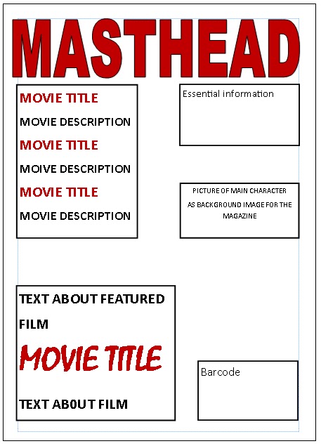
The second flat plan that i have produced is for an entertainment magazine front cover that features my film:
Rational
For my media coursework I have decided to make a trailer for a film, the genre of my film is going to be horror. The first flat plan I have made is for a magazine front cover featuring the film. The colour scheme that I have used is black and white for the pictures and then red and black text, I have used these colours because they contrast each other and therefor are clear to read and catch the audiences eye, another reason for the colour scheme is that the dark colours represent darkness and the red represents blood which fits in with the horror theme.
The masthead of the magazine is in a large, bold font that is easy to read, it is in the top of the page so that it is the first thing that the reader will see which is important for the magazine so that the reader can recognise which magazine they are reading, which is important for both regular readers of the magazine and new readers.
The picture will be the background for the magazine front cover so that it also stands out as this is another main thing that the reader will look at, and will determine if the reader wants to purchase it. The image will be in black and white so that it looks dark and gloomy rather than colourful, which could be the effect that I would get if I used a colour picture, however I may try to use just a dark picture that is still in colour however this will be decided when the photos are being taken after I try some different lighting techniques.
The subheading for the film will be in big black text that will be slightly larger than the rest of the sub headings on the magazine cover, as it is the featured article and therefor is the sub-heading that the reader should see first. I have chosen to use a red font that is different to the rest of the fonts and is more relatable to the theme of horror, however it may look too much if the full subheading was in that font also, and so having a different font will make the actual film title stand out and so the reader will know automatically which movie is featured enticing their interest in this film.
No comments:
Post a Comment